Civil Air Patrol is being transformed. Its level of sophistication has advanced significantly in recent years. For example, CAP’s fleet is being transformed from” steam gauges” to glass cockpits that can be programmed to display and to fly CAP search grids. In fact, CAP no longer needs to wait for the weather to break or for the sun to rise to begin a search – we can start in minutes, using cellphone forensics and radar analysis.
A similar level of sophistication touches every aspect of Civil Air Patrol – IT (Innovation), philanthropy (the CAP Foundation), cadet programs (Cadet Interactive), aerospace education (STEM — science, technology, engineering, and math), member education and training (Volunteer University), chaplain corps (resiliency programs), and now marketing too.
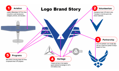
Over the past two years, Marketing and Strategic Communications (MAC) has been working to better align the CAP brand as a Total Force partner. The U.S. Air Force auxiliary’s new logo tells a brand story about aviation, volunteerism, partnership, and heritage and projects a more youthful, modern, Air Force-style look.
CAP’s Board of Governors voted unanimously April 23 to adopt the new logo, which “accomplishes several things and includes some unique benefits,” said Randy Bolinger, chief of marketing and communications.
“The bottom line is, we are not the Civil Air Patrol of the 1940s, and the new corporate identity makes that obvious,” Bolinger said.

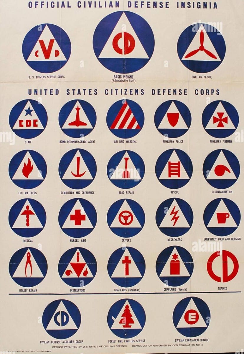
Out With the OldThe Office of Civilian Defense, the basis for the original Civil Air Patrol symbol, was disbanded in 1945. Since that time, CAP has been associated with something that has long since been defunct.
“From a brand perspective, being associated with something that is obsolete is not a strong brand position’” Bolinger said.
“Imagine General Motors spending billions of dollars to build and name a state-of the-art stadium in Detroit. Now imagine that GM chose to name the stadium the Oldsmobile Center, after a product line that was discontinued decades ago.
”True, the Oldsmobile Center name would be a wonderful tribute to a discontinued product line. that resonates with people nostalgic about the Cutlass, 442, Delta 88, and Tornado. But using the name of an obsolete product line does nothing to advance today’s innovative General Motors working toward an all-electric product line by 2035,” Bolinger said.
That logic applies to Civil Air Patrol as well, he said. “The triblade symbol from the Civilian Defense glory days of World War II is a wonderful tribute to our past, but that symbol has precious little relevance today and does not accurately reflect the extent that CAP has evolved in the past 80 years.
“Simply stated, brands that don’t evolve, lose relevance,” he said. “While Oldsmobile was the first auto manufacturer to offer an automatic transmission and produced some of the best-selling models, that amazing legacy couldn’t keep the brand from losing both its popularity over time and its demographic until GM ceased production of the once-beloved Oldsmobile.”
Similarly, each new generation of CAP cadet becomes farther removed from any emotional attachment with World War II and Civilian Defense. Other than the emotional equity and nostalgic qualities of the triblade, the triblade symbol from a bygone era has no relevance in today’s CAP.
“Is the triblade symbol cool – kind of in a mid-20th century retro design way? Does it reflect today’s CAP? Not really – it’s a heritage piece that should be set aside to make room for something that reflects the dynamic nature of today’s CAP,” Bolinger said.
Some Borrowed, Something Blue“Most corporations update visual identities (a logo) periodically as a brand management best practice,” he said. “Doing so reflects change — change in ownership, technology, direction, products, etc. CAP recently updated an obsolete mission statement to accurately reflect who we are today.
“And who we are today, and since 2015, is a Total Force partner of the Air Force, not part of Civil Defense.”
Until the turn of the century, Air Force went through a 60-year stretch without modernizing its logo. Today’s Air Force logo is a more accurate representation of a modern air force.
“While the Air Force beat CAP to the modernization wake-up call by more than two decades, CAP can now benefit from being able to take some visual cues from the Air Force logo to incorporate into our own,” Bolinger said.
“The new CAP logo is clearly in the same Air Force Total Force family, having borrowed inspiration from the wing shape and hiding the legacy shape (the Civilian Defense triangle) in the negative space as the Air Force did with the star and globe.
“We also added something blue – the logo color itself that closely aligns with the Air Force. In fact, the Air Force and CAP logos nest together quite nicely as if they are, well, partners.”
Best of Both WorldsRegarding logo changes as part of brand refresh effort, love it, hate it, or undecided, there’s good news for all – the triblade lives on. While the new corporate logo (the “Flying V”) becomes the external persona of a Total Force partner, the triblade will remain part of CAP’s identity system in the command emblem used on aircraft, vehicles, flight suits, and countless more applications. Further, the triblade will remain the heart of the CAP seal.
The PowerPoint presentation shown to the Board of Governors before their vote approving the Flying V can be downloaded here.
CAP’s Brand Portal provides high-resolution versions of the logo, instruction for proper use, new business card templates, website graphics, presentation templates, virtual backgrounds, and much more.


